I worked as a brand designer for Whittard on a 9 month contract. During my contract, I resigned the company's icon library, lead the development of brand localisation guidelines for China, and lead email design as the company underwent a brand refresh.

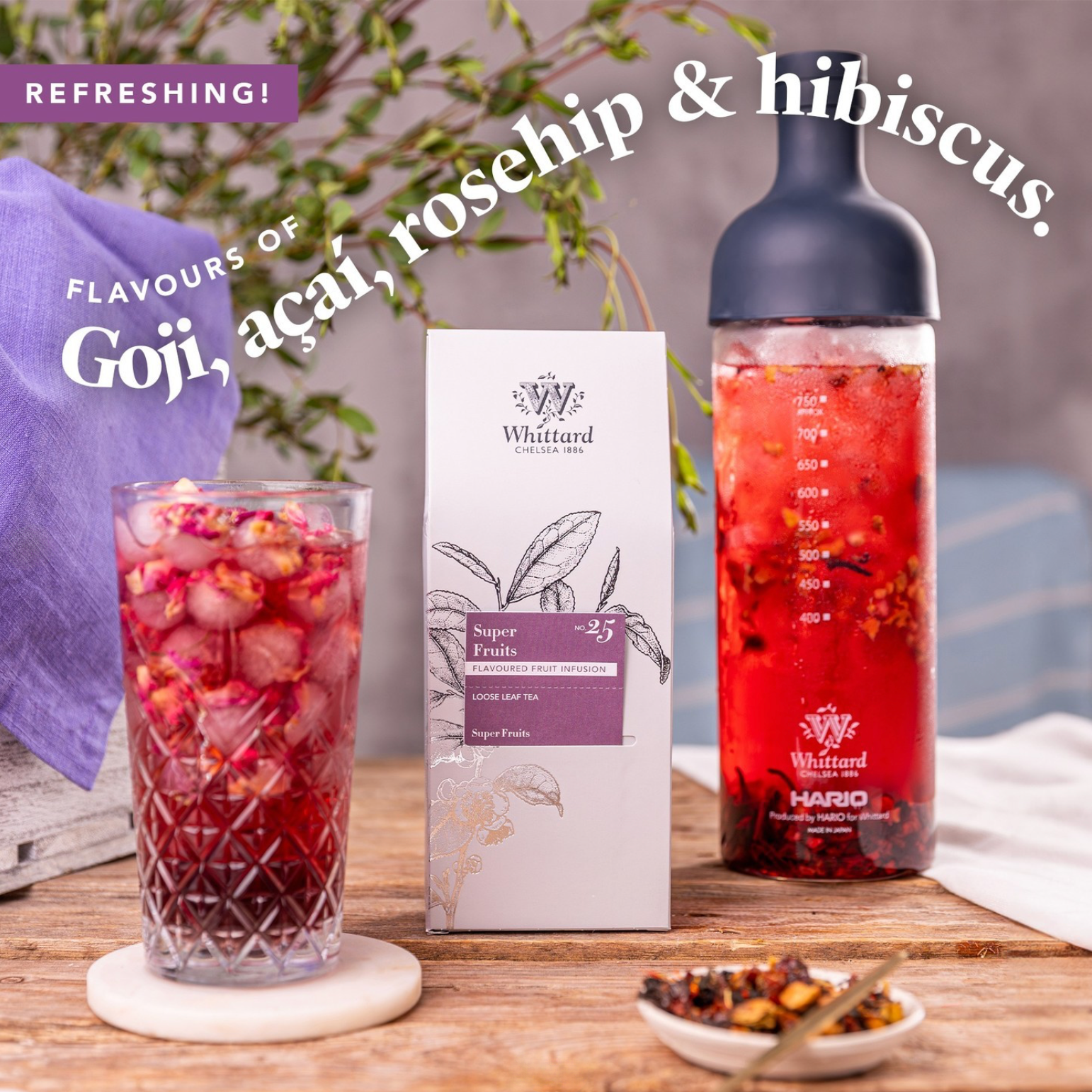
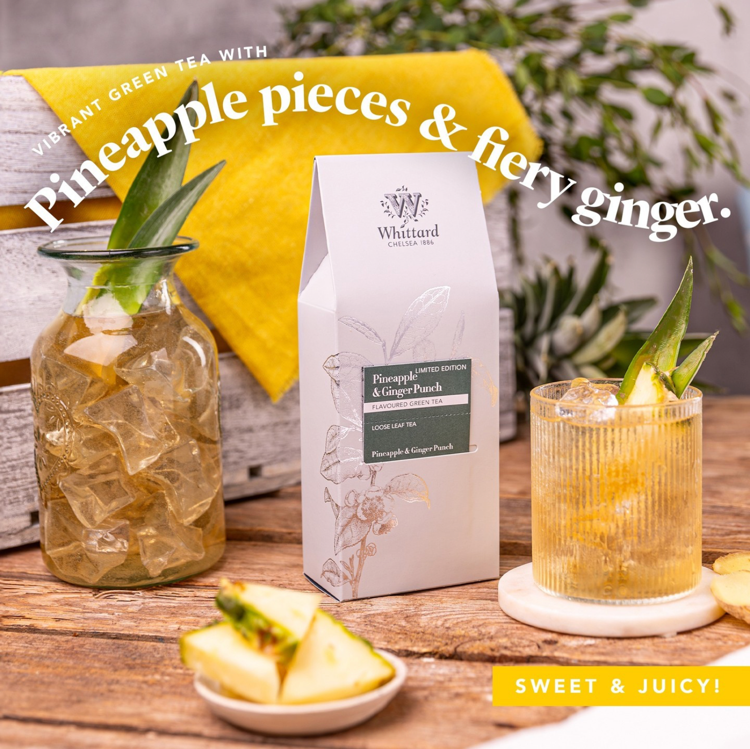
Social Media Design - Instagram Carousel
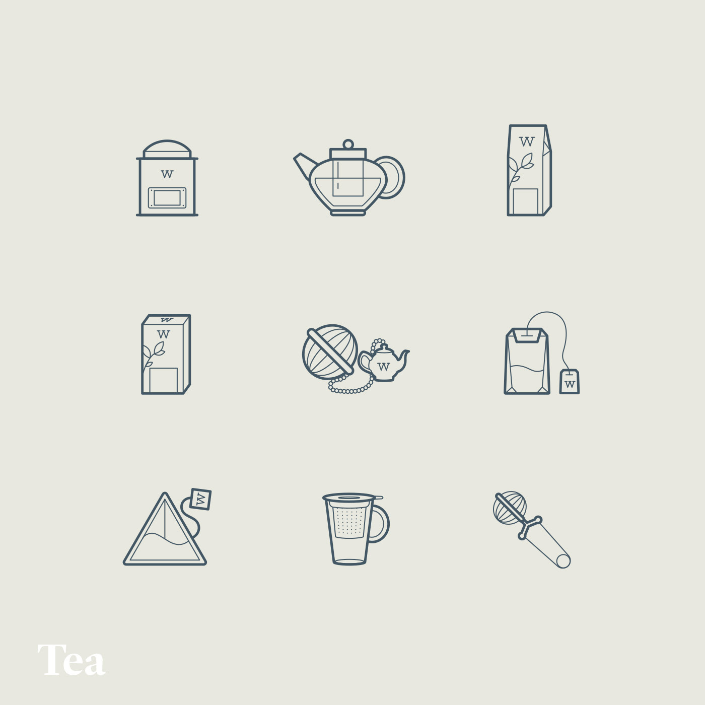
Brand Icon Library
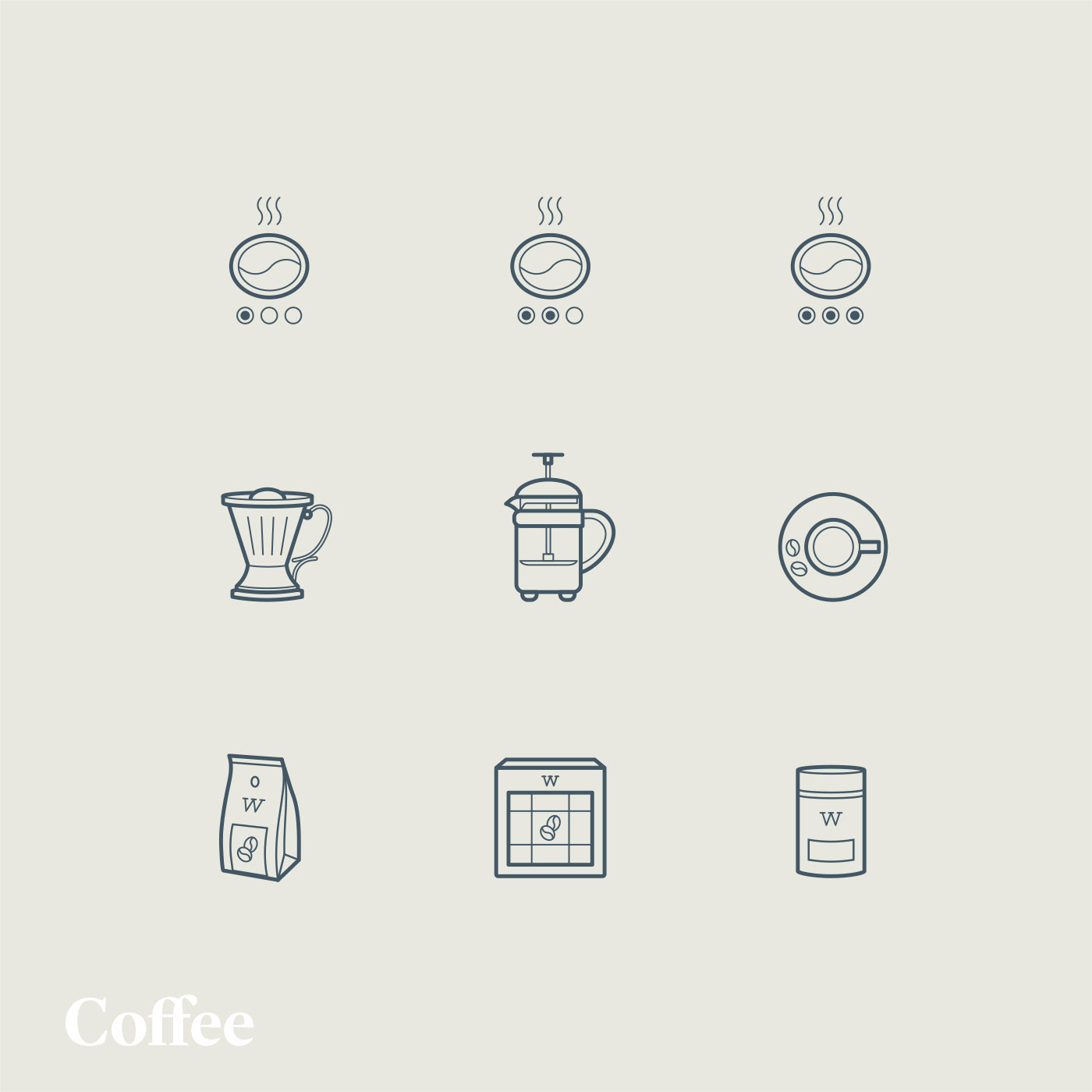
When I arrived at Whittard, the icons in use were a mix of vintage illustrations in a mix of styles, with stock-style single line illustrations. They lacked consistency, and also no longer resonated with the direction the brand was taking. I pitched several styles for roll-out, then created a library of over 150 icons for use across the business. Tea, coffee, hot chocolate and equipment icons now accurately reflect the products Whittard sell, and the repeated, simplified "w" motif is used across the library to make icons ownable.



China Localisation Guidelines
As Whittard expanded into new territories, I was tasked with liaising with the China team to create localisation guidelines that were tailored to local tastes and preferences, while still being recognisably "Whittard".
Email Template Refresh
As part of the larger brand refresh being undertaken, I worked with the email team to update Whittard's broadcast and automation email templates, bringing them in line with the rest of print and digital.


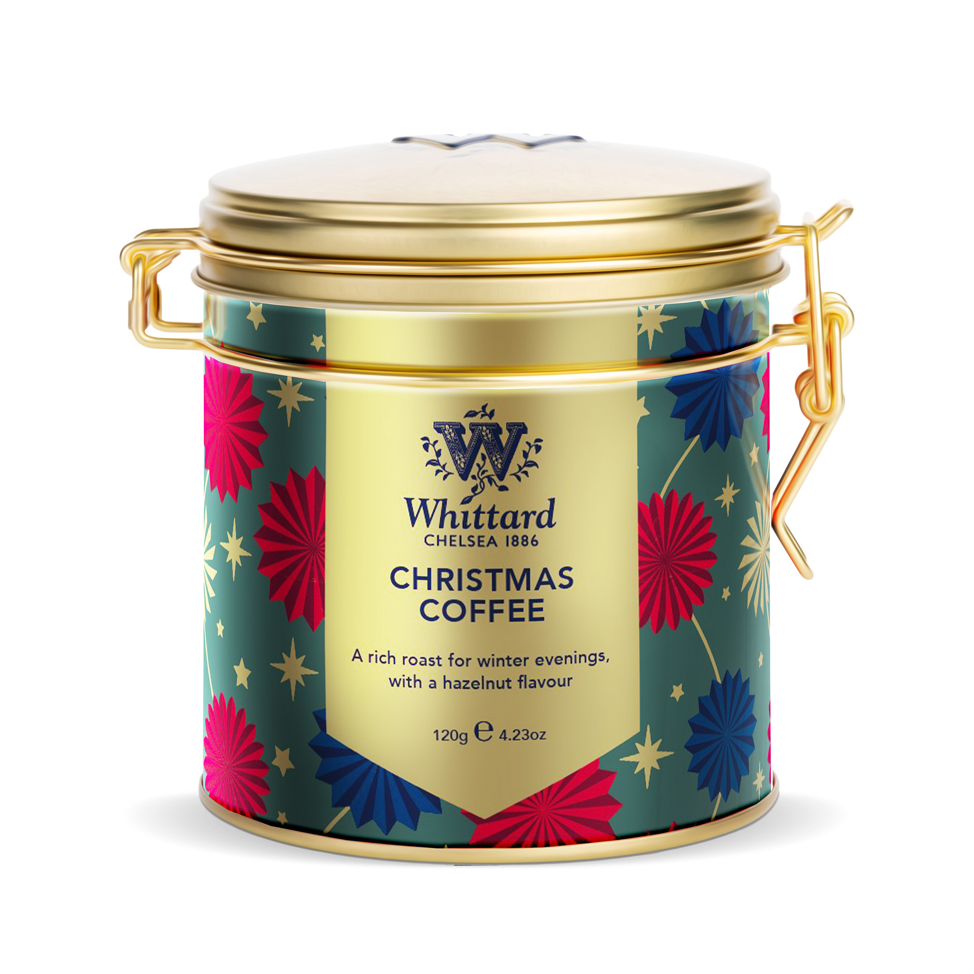
Smart Mockups for Whittard Packaging
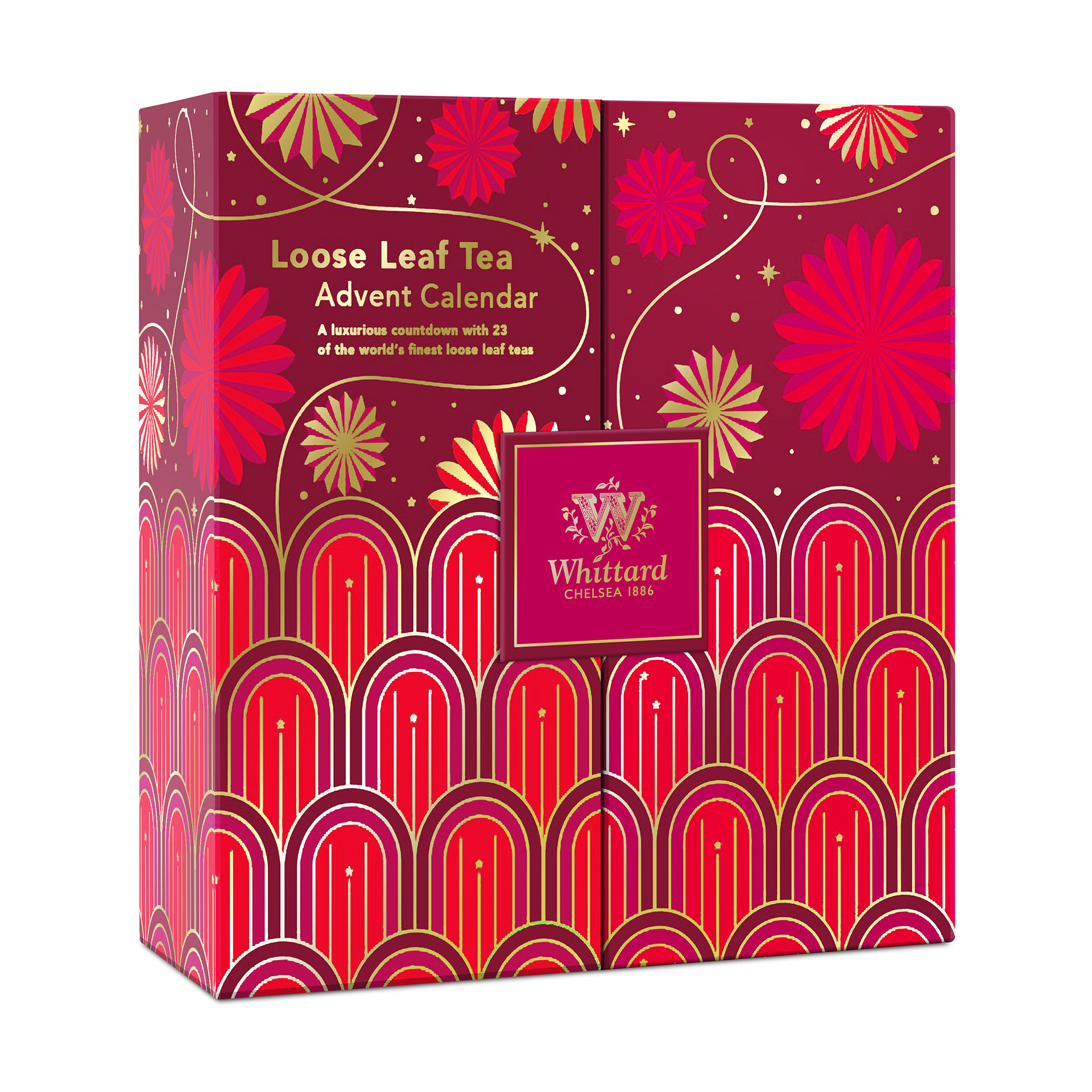
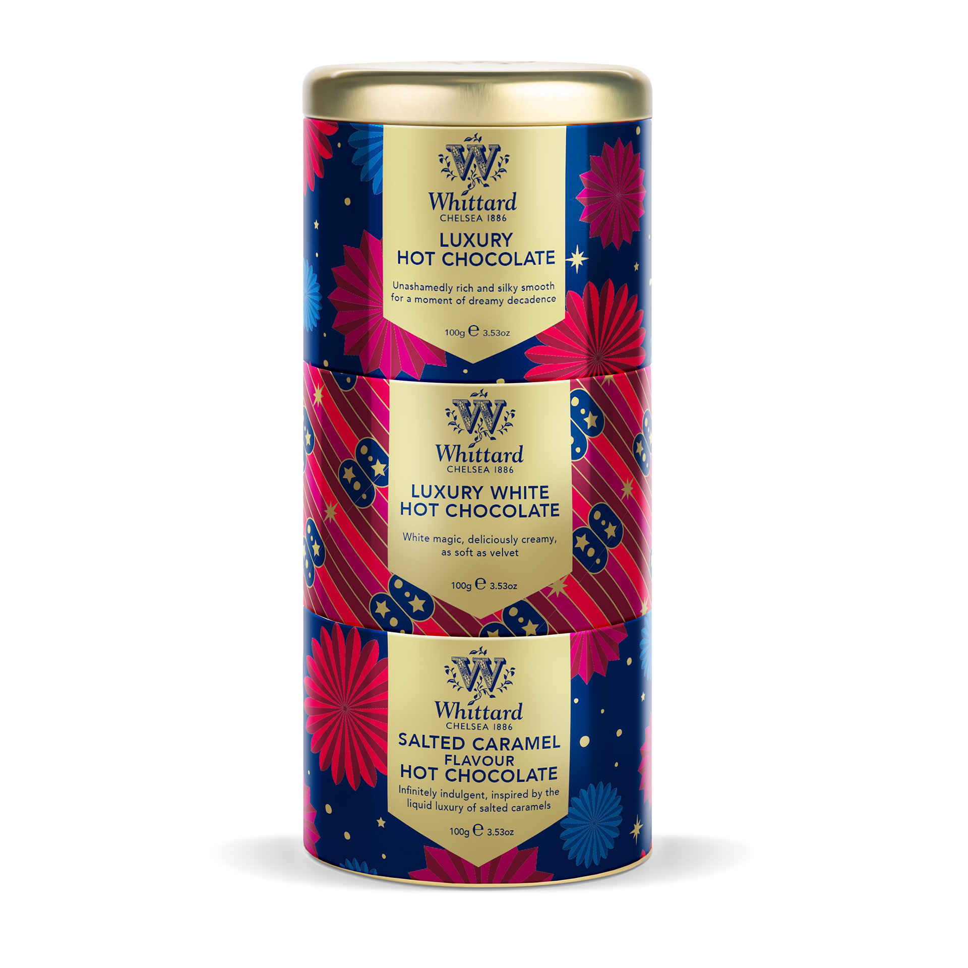
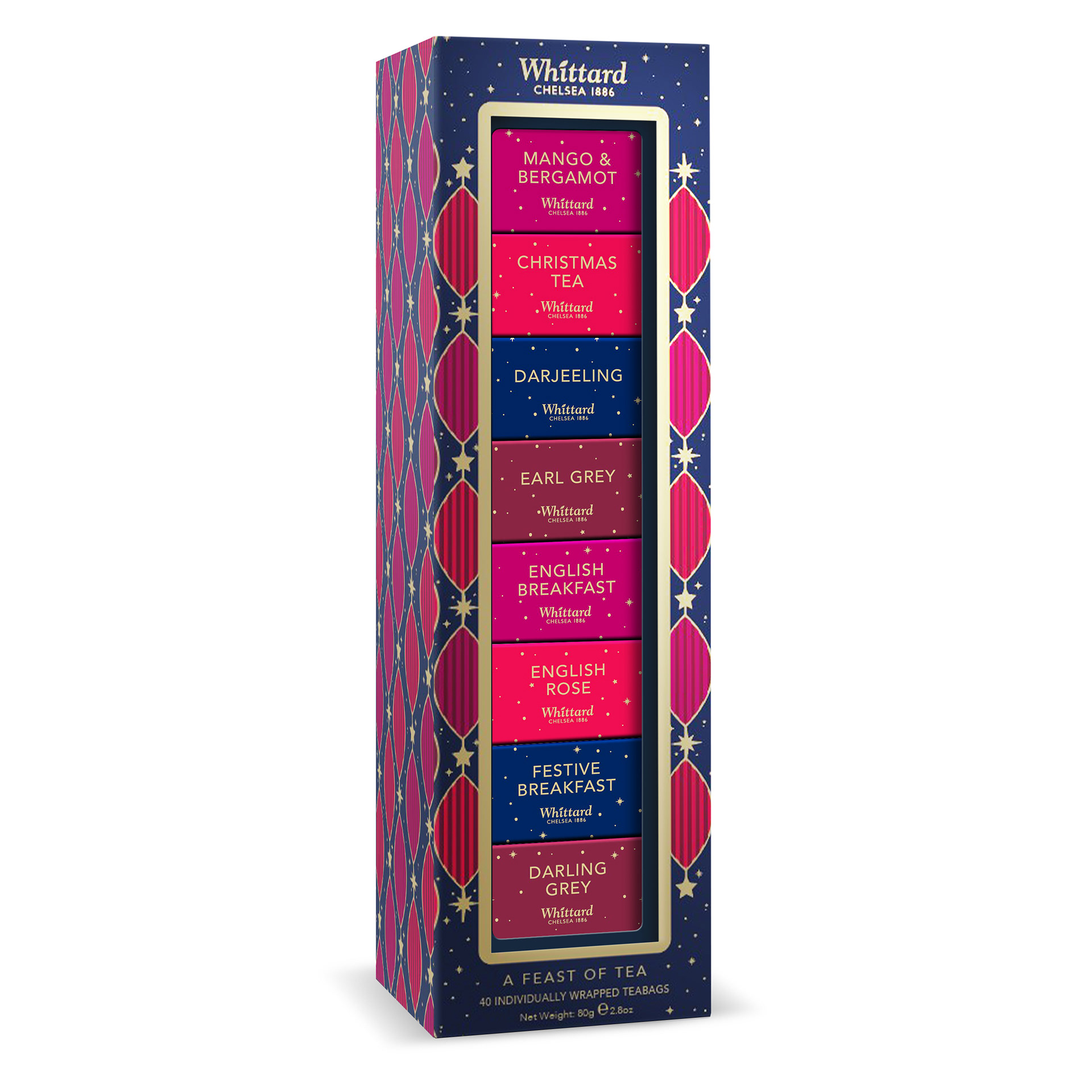
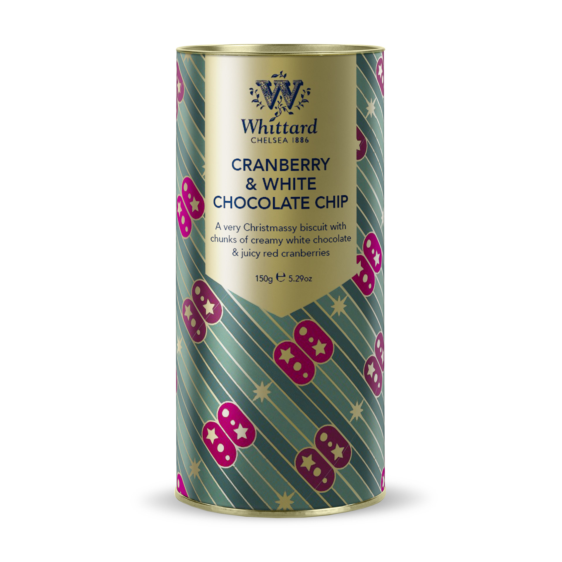
I created Photoshop smart mockups of all Whittard of Chelsea's packaging, allowing renders of future products to be created quickly and consistently at high quality. This streamlined the creation of mockups for the marketing and sales team, saving countless hours of manual work by automating the process. Now, final print artwork can simply be added flat to a photoshop smart mockup, and updated with new season lines or if minor corrections are needed.
